What to Include in a Real Estate Landing Page
Design the best landing page for your real estate business by including these 11 absolutely essential elements to get your audience in and turn them to leads
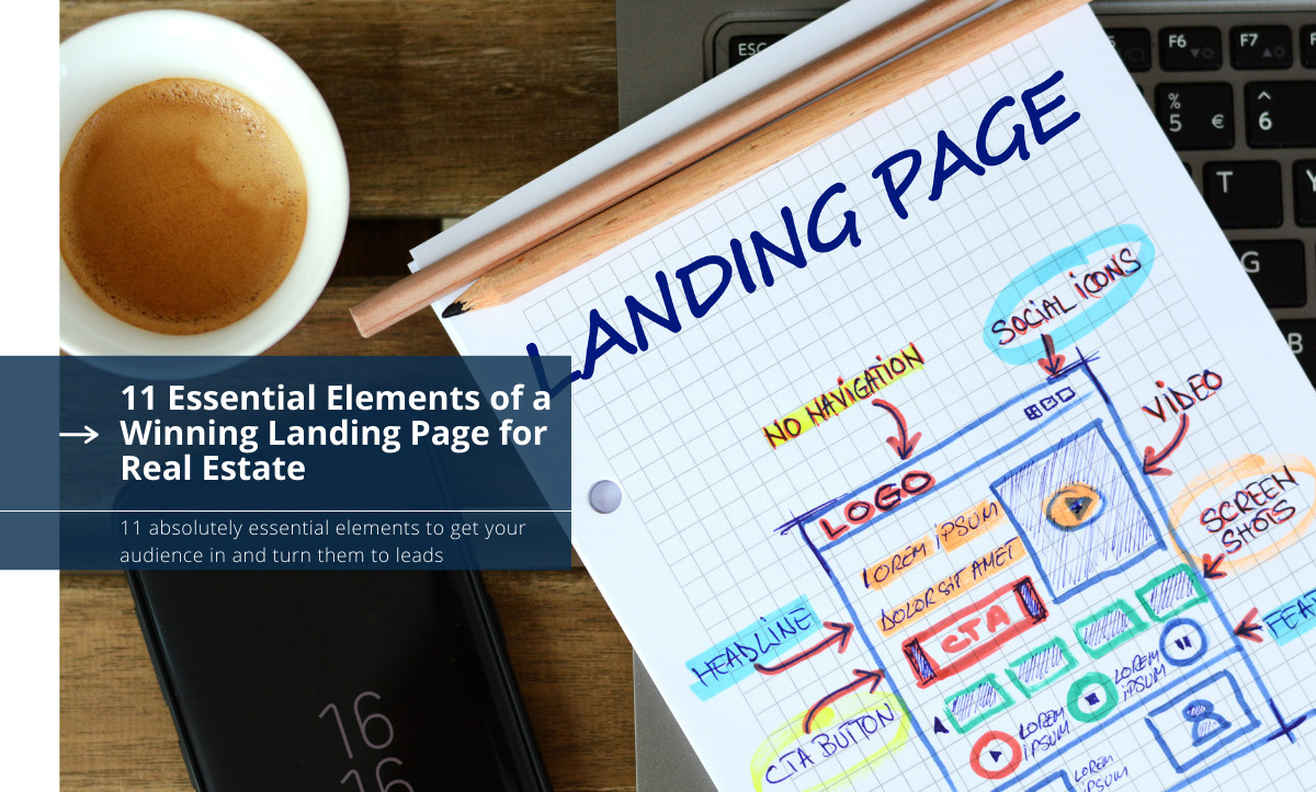
One of the best tactics to generate leads in real estate is using landing pages. Landing pages can be very effective for real estate provided that they are done well. They can be used to attract your target audience and get them to do what you want them to. Be it downloading a certain file, eBook, signing up for a service, subscribing, buying a product or service, etc. All this can happen with a well-designed landing page. But what exactly is a proper real estate landing page and what are the essential elements of a winning landing page?
Essential Elements of a Winning Landing Page
In this article, we will go through the essential elements of a winning landing page for real estate. We will show how to use landing pages to win over your audience and turn them into leads:
1. Consistent Branding and Logo
One of the first things your audience will see when visiting a landing page is the branding of the page. This should be clearly indicative of your business. The colors, themes, designs, and the logo you use on your landing page should all be consistent with your business: with what you have always been using. Do not try using a new design as this might create some ambiguity for the visitors.
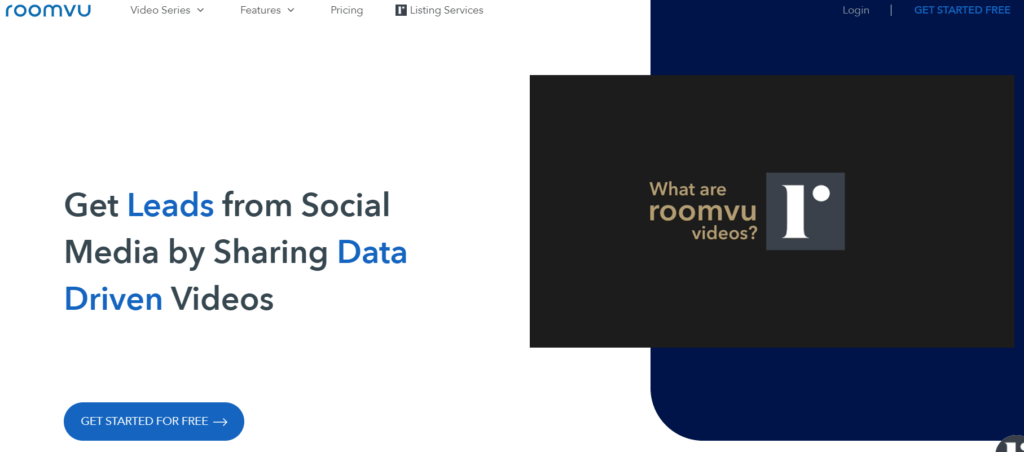
However, this does not mean that you need to make your landing page’s design complicated. In fact, the best landing pages use simple yet stylish and professional designs while utilizing your branding and unique design.
2. A Clear and Compelling Headline
Whether it is a page from the newspaper, magazine, or website, or any other kind of page online or offline, it is natural for people to want to know immediately what the page is about. If they find it interesting, they will keep reading, otherwise, they will forget about it. That’s why we have headlines. Headlines announce to readers what they are about to read.
On landing pages, regardless of how visual they are, there should be headlines to let your audience know what the pages are about. The headline should:
- Draw the audience in
- Tell the audience what the page is about
- Wow the audience
- Make them keep scrolling
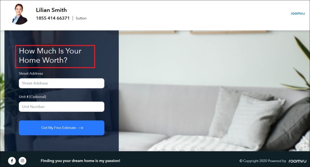
Failing to design a clear and compelling headline will result in losing an audience before they even know what’s being offered on the page. Therefore, make sure you do not blow your chances right off the bat by ignoring the headline. A great landing page headline should:
- Be consistent with the email or CTA (Call To Action)that brought the user to the landing page
- Be short and concise (explain more in the subtitle) in line with your USP
- Should be written to get the audience to continue reading
- Indicate what makes the product or services great
- Say why the service or product is unique and different
3. Unique Selling Proposition
Unless your landing pages offer something unique and very interesting for visitors, the landing page will not go far. This is regardless of how great other elements on the landing pages are. Your USP (Unique Selling Proposition) is what excites the visitors and makes them click on your CTA. It should be unique, valuable, and compelling enough to turn the visitors into clients. Avoid offering the same thing as other agents. You want to offer something new and attract attention.
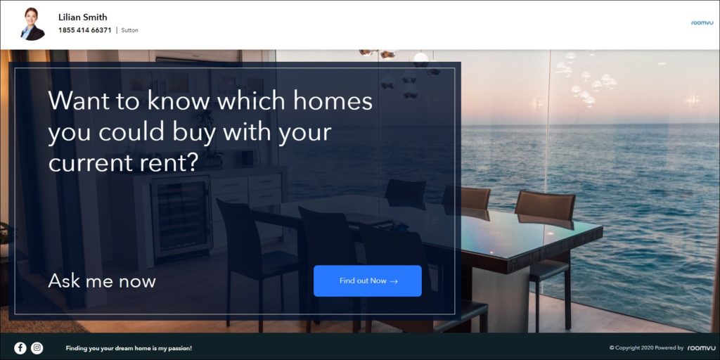
You need to explain what the benefits are. Why should visitors click on your CTA? What, exactly, is in it for your visitors? If you fail to show the unique benefits of what you are offering, your landing page will not be successful. It will be just another landing page to selling what is already available from other agents.
4. Images
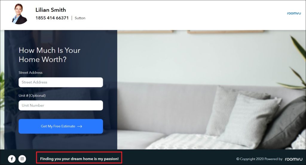
There is no doubt that nobody will bother to spend time on a landing page that includes all text. Another one of the essential elements of a winning landing page is images. Visuals improve engagement and make what you have to say on a landing page more exciting. Visuals on your real estate landing page should:
- Be interactive
- Tell a story
- Guide visitors toward the Call-to-Action.
When choosing images and visuals for your landing page make sure you stay from stock images. These will have been used on many pages and do not look original. Such images will fail to convey your desired message and are not as effective as images that are designed exclusively for the service or product you are promoting.
5. Videos
Videos? Why? Well according to research including videos on landing pages can increase conversion rates by 80%. In fact, as videos are easier to watch they generate more user engagement. That’s why video hosting services like YouTube are getting more and more popular.
Make sure when you add your video:
- It is above the fold
- Uses a great thumbnail
- Includes a great CTA
- Is short and concise
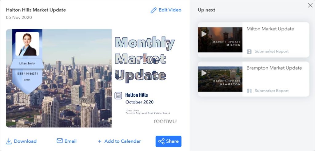
Another study shows that 96% of customers find videos helpful when deciding to buy a product. By adding a quality video to your landing page you increase your chances of converting visitors to clients. It keeps visitors on your landing page and gets them to consider the offer more seriously. However, do not go overboard by using long videos. You risk boring your audience and taking too long to convey the message.
You can use the video for different purposes on your landing page. They can be used to:
- Explain the benefits of your services or products
- Provide social proof through video testimonials
6. A Killer Copy
Visuals and videos are vital elements of a great real estate landing page, but it does not mean that you are done and should not care about the copy. Just like other parts of your landing page, your copy should:
- Be clear and concise
- Elaborate on what the headline states
- Explain what is offered and why the audience is on the landing page
- Detail how your product or service will help your audience
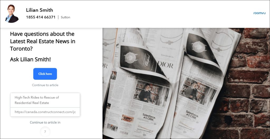
One of the most important things to keep in mind while writing your copy is that you need a perfect balance. Too much copy can tire and bore your audience while too little copy will leave your audience confused and unwilling to take action. But as a general rule of thumb,
The more novel and newer your product is the more copy you need. For products and services that are familiar in the real estate market, you do not need to go with long copy.
7. Limited Navigation
The landing page should convey a single and clear message. Therefore, cluttering the page with too much information is not recommended. This will confuse your audience. Navigation through the landing page should be limited and the elements on the page should guide the visitors through your desired path leading to the CTA. On other pages of your website, there can be a lot of information with multiple links. A landing page is different. It has a single purpose therefore it should include only what you want the visitors to do.
8. The Perfect Call to Action
Unlike other pages on your website, landing pages follow a single purpose. What that purpose is can vary depending on your marketing strategy. You can use landing pages to:
- Get new leads
- Gain new subscriptions
- Get people to download an eBook, etc.
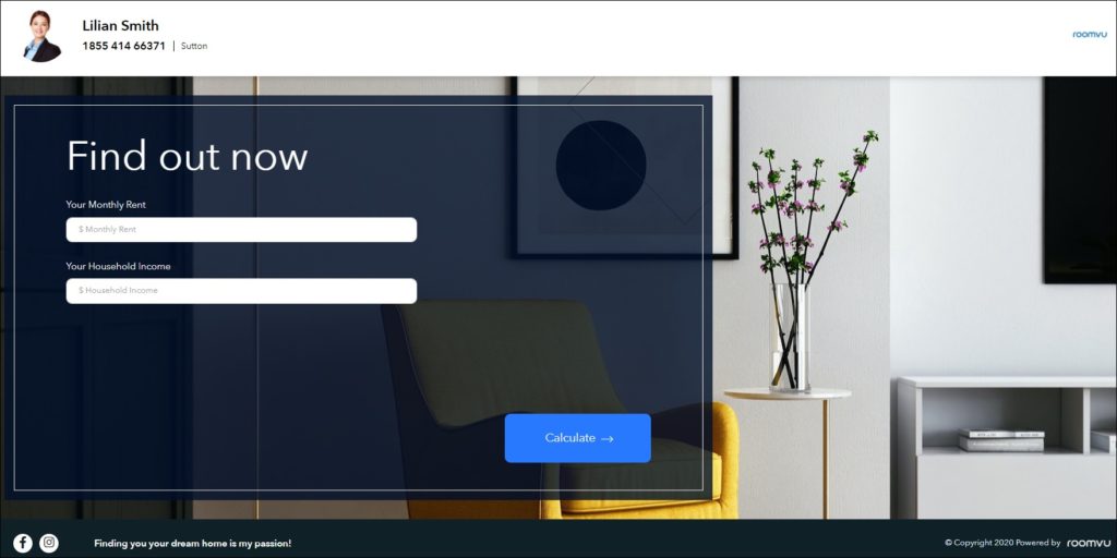
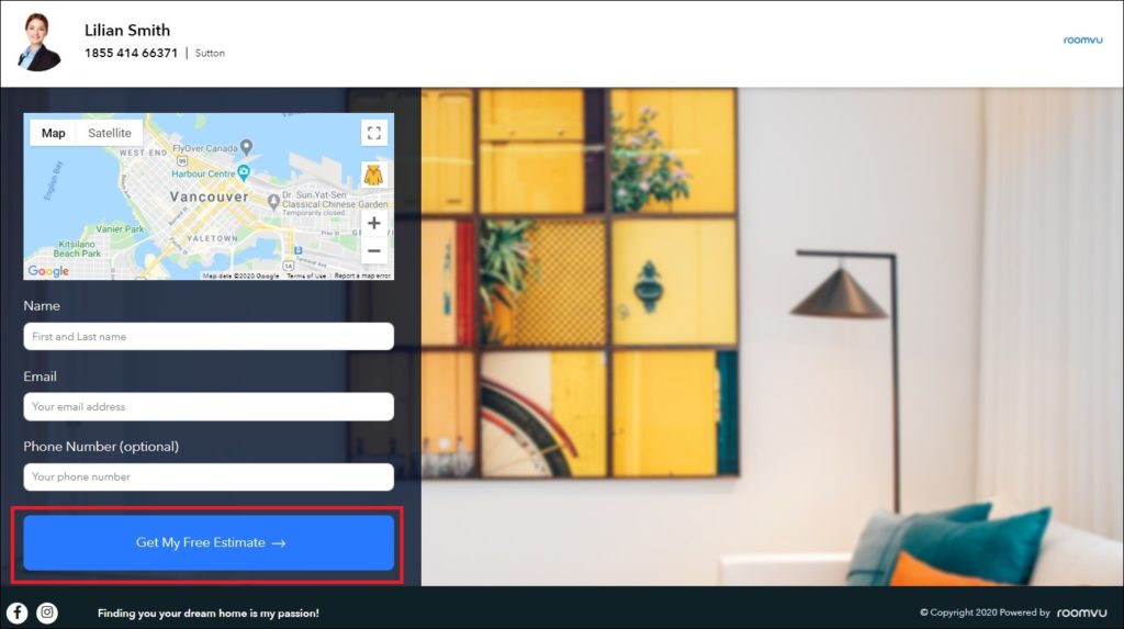
Your CTA on the landing page is the ultimate step to get the audience to take action after evaluating the content on the page.
The great CTA should:
- Look great visually
- Use perfect copy
A great CTA should be exciting and express what the audience will get
Remember that your landing page needs to have a single CTA. Do not confuse your audience by using multiple CTAs. This will only decrease their chance of being clicked on.
9. Premium Offers and Lead Capture Forms
Your landing page should offer a unique and premium offer that is only accessible when visitors provide their contact information by filling in a form. The premium offer should be valuable enough to visitors for them to submit their information. A free trial, a demo version, an eBook, etc., are among some of the premium offers you can use on your landing page. Whatever it is, make sure it is valuable enough to convince and get visitors to do what you want.
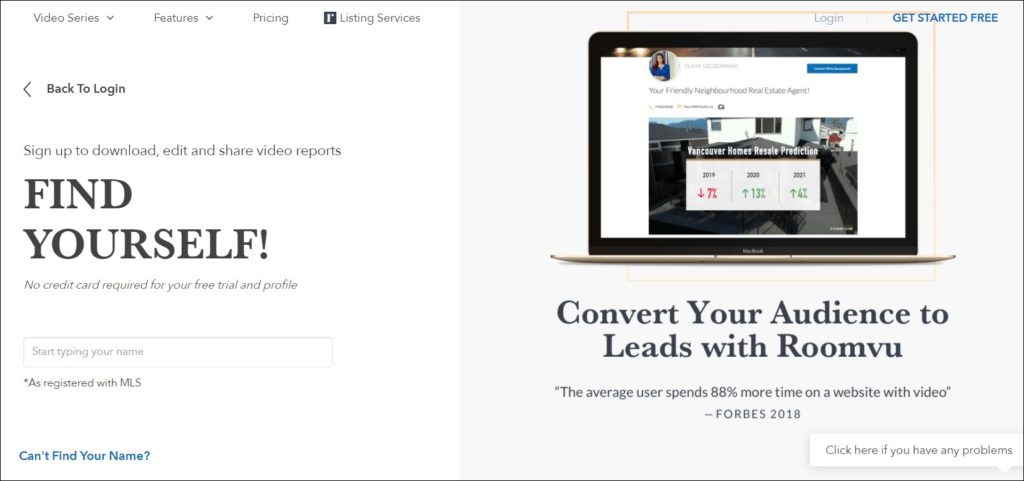
Avoid asking your visitors for too much information as it might discourage them from filling the form. Only ask for the information you need and leave the rest. You can ask for important information such as:
- Name
- Company Name
- Job Title
10. Social Proof
As a real estate agent, one of the purposes of using a landing page is to get the visitors’ contact information as unqualified leads which can be later nurtured to turn them into qualified leads. However, visitors might not feel comfortable with submitting their information. In order to solve this issue, you can offer reviews from your past clients. Additionally, you can offer more information on what the visitors will get by submitting their information and why you need their information.

One of the greatest ways to build trust is by using testimonials from your past clients. You can include their image and what they have said about your product or service. You need to ask for their permission for using their testimonial on your landing pages.
11. Mobile Friendly
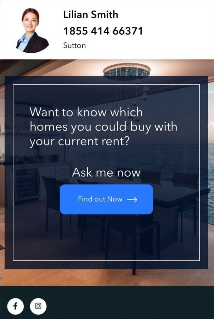
The last essential element of a winning landing page is mobile-friendliness. Mobile devices are very popular these days and many people use their cell phones and tablets to browse the internet, check their emails, make purchases, etc. Therefore, making sure that your landing page shows properly on a mobile screen is very important. Failing to make your landing page mobile-friendly and responsive will only disappoint your visitors and make them navigate away.
Test Your Landing Page
The perfect landing page depends on many different factors. The elements mentioned in this article are all essential for a landing page to work. However, the design, copy, CTAs all can be improved. Always make sure you A/B test your landing page to find the best combination which will have the greatest impact. This can be truly beneficial when you are not sure about some elements of your landing page like the CTA or copy. Believe it or not even minor modifications can turn out to have a great impact on the overall performance of the landing page.
Essential Elements of a Winning Landing Page: Takeaways
Landing pages are great for real estate businesses, yet not any landing page will prove to be effective. The elements mentioned in this article have proven to be essential and effective for optimum results. However, getting the perfect landing page requires understanding your target audience and the market. Designing the perfect landing page takes time and effort. If you are not sure about what you are doing you can always ask for professional help to promote your real estate business. We at roomvu offer effective real estate marketing tools that take care of everything an agent needs from the content to the social media promotion and finally the landing pages you need. Registration is easy. Join now and start promoting your real estate business like a boss.
Read More: Real Estate Landing Page 2020: Create Converting Inbound Platforms


One Comment