How to Have a High Converting Landing Page for Real Estate
Learn how to have a high converting landing page for Real Estate that works with practical tips and examples

Since 51% of home searches start on the internet, when it comes to generating leads online for the Real Estate industry, creating a landing page is the first step for every agent. So in this article, we will tell you how to have a high converting landing page for Real Estate that works. Without landing pages, you cant run ads and you will miss out on a lot of things. After all, your website is not enough for generating leads. Your website is an all-in-one solution for a wide range of needs.
How to Have a High Converting Landing Page for Real Estate
Landing pages are absolutely necessary for your Rela Estate business, especially if you are running ads. You just can’t link your ads to your website. They lack the simplicity and purpose to convert your visitors and will waste the money you have spent on the ads.
Pick the Type of Landing Page
It is absolutely essential to understand the different types of landing pages before you go on and create one.
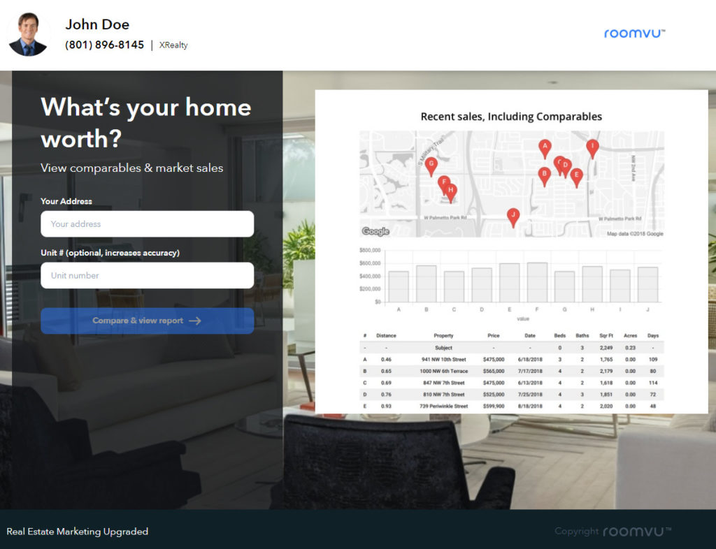
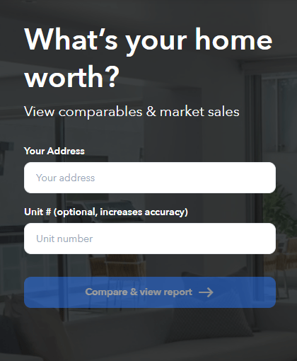
What is Your Home Worth
This type of landing page lets users type in their address and get a quick idea of how much their home is worth. This type of landing page focuses on seller leads which many believe are harder to get than buyer leads.
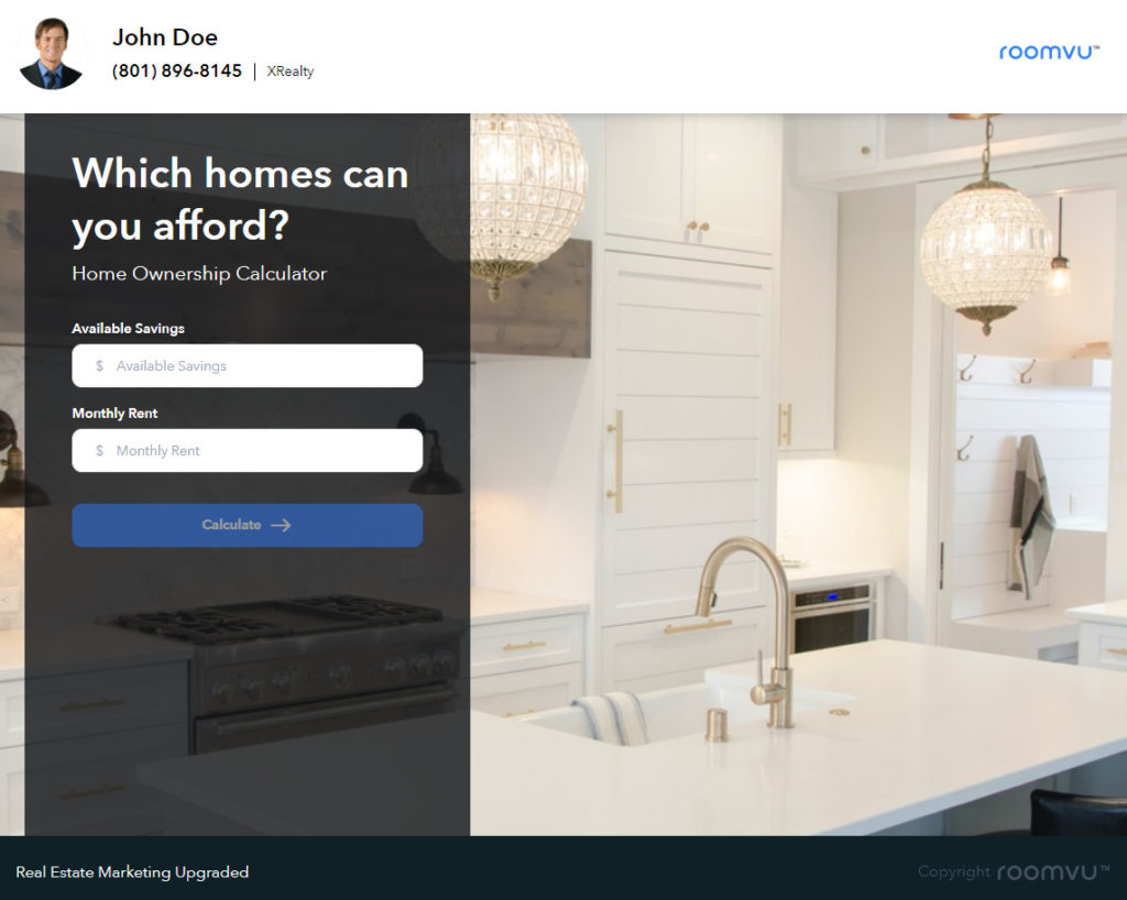
Which Homes You Can Afford
This type of landing page focuses on those who are currently renting a home and will give them a quick idea if they can afford a home with the rent they are paying now.
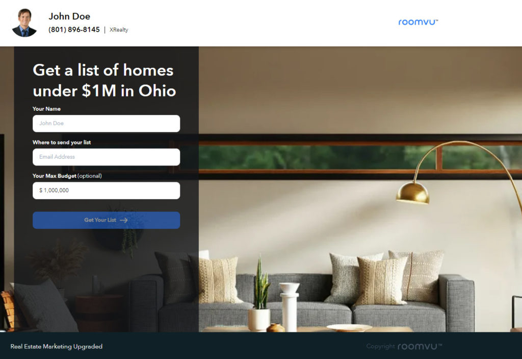
Get a List of Homes Under X$
This one again focuses on buyer leads and will ask the users to provide how much money they can spend and then shows them a list of homes they can afford.
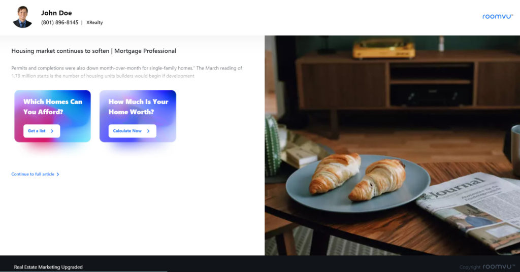
Free Content
This landing page focuses on those on top of your funnels who may not be ready to buy or sell their home. By providing their contact information you can add them to your newsletter list and nurture them further along your funnel.
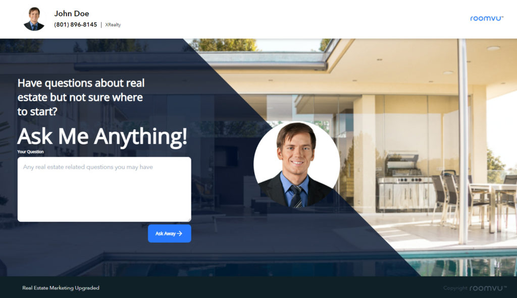
Ask Me Anything
This landing page acts like the one above but provides the users a free and convenient way to ask their questions without being pushed to do anything.
Aligned with Your Ads
Another thing that you have to keep in mind is that basically, your landing pages will be the destination for your ads where users click on a button and are navigated to your landing page. Therefore, it is essential to make sure that your landing page and ad are algined. If you promise something in your ads but fail to talk about it on your landing page, users will be disappointed.
Make Your Landing Page Easy to Navigate
Landing pages are built around a single purpose and that is what you need the user to do. Everything on the landing page from the images, content, copy, messaging, CTA, etc. all need to serve your purpose. Therefore, avoid confusing the users with extra links and messages and on the other hand, make sure your forms are short and concise. You do not want to bore the audience by forcing them to fill numerous fields of information to get what you have promised them.
Make it Look Professional
Simple and concise does not mean that your landing page has to look boring. Make use of eye-catching images and colors that follow your branding. Make sure your logo and headshot is displayed in a neat manner. Avoid clutter and use amateur copy, design, etc. If you are not sure what you are doing, you can always ask marketing professionals to help you.
Make it Mobile-Friendly
The majority of users access the internet from a mobile device. e now use computers, tablets, and smartphones to scour the web, scroll through social media, and access the information we need. In fact, close to 80% of Americans own a mobile device and the majority of search traffic on the internet comes from them!
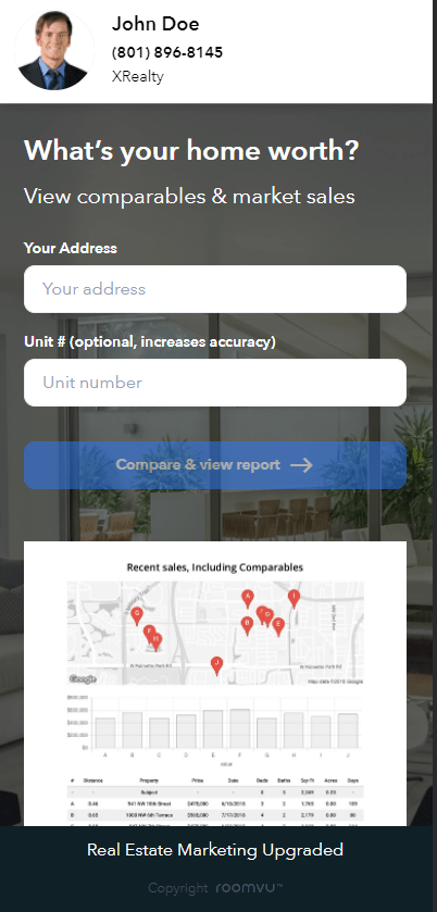
Therefore, your landing page must be responsive. That means it is mobile-friendly and will show properly on a mobile device. Failure to do so will result in your landing page showing very small on a mobile device where the users had to zoom in and scroll;l; around to see the content of the page. And that is definitely a big no for users. No one will bother to do so.
How to Have a High Converting Landing Page for Real Estate: Final Words
Everything on a landing page for Real Estate has to be simple, eye-catching, concise and to the point to make sure that it keeps users on the page and guides them towards your CTA. These tips on how to have a high converting landing page for Real Estate, are essential to creating a landing page, fast, mobile-friendly, clear, and beautiful. You pay a lot for your ads, you might as well make sure your landing pages live up to the promises you made on the ads.


One Comment