How to Optimize a Landing Page for Real Estate
Everything on the landing page all focuses on one goal. In this article, we will tell you how to optimize a landing page for Real Estate.
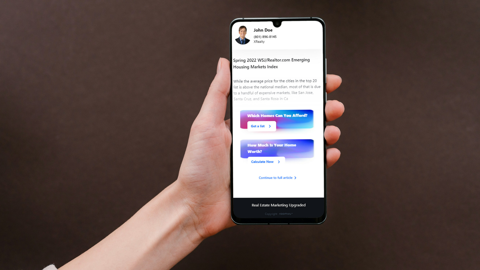
If you are trying to find leads online to sell, buy or rent a house, using a landing page instead of a traditional website can provide you with many beneficial features. In fact, using a website for generating leads is a very bad idea since it serves a wide range of purposes and fails to focus on a single goal like lead generation. Landing pages can reduce distraction as they are designed to serve only one purpose. Everything on the landing page, from images, to copy, to buttons, all focuses on one single goal. In this article, we will tell you how to optimize a landing page for Real Estate.
How to Optimize a Landing Page for Real Estate
Let’s see how to optimize a landing page for Real Estate:
Be Honest
What you write on the landing page should be clear, honest, and concise. You should use descriptive language for your offer to make it easy for the user to understand what you are giving them. However, for the sake of convincing your visitors, you should not be dishonest. Trust me, your visitors will easily tell what is real and what is not. People will not work with you if they find your words and offers dishonest.
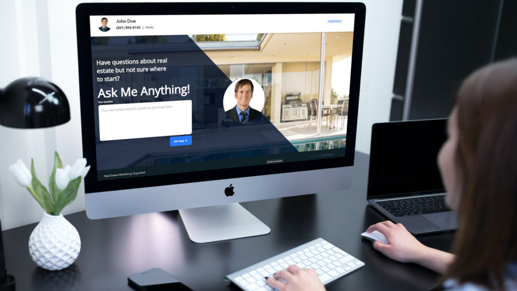
As a matter of fact, buying, selling, or renting a home is a huge financial decision and people are more sensitive about how they do it. Trust is the first thing they will be looking for in an agent as they will want to risk their finances on a large scale.
Show The Goodies
When people visit your landing page they found your offer interesting. Now that they are it, you need to give them a reason to accept your offer. Depending on the type of landing page for Real Estate, you need to clarify exactly what they will get by going through the landing page and clicking on the button. For instance, if you are using a “Rent-to-Buy” landing page, tell your audience that the landing page will save them from renting a house for the rest of their lives and will help them find out if they can buy a home with the rent they are paying now.
Make it Personal
A landing page is designed around a single purpose. It is completely different from your website. They are usually used with online ads. When users click on your ad they are taken to your landing page. When running ads online, you target a certain group of people and your landing page should provide a personal experience for them. Everything from the copy, images, button, etc should resonate with the needs of your audience.
Make it Eye-Catching
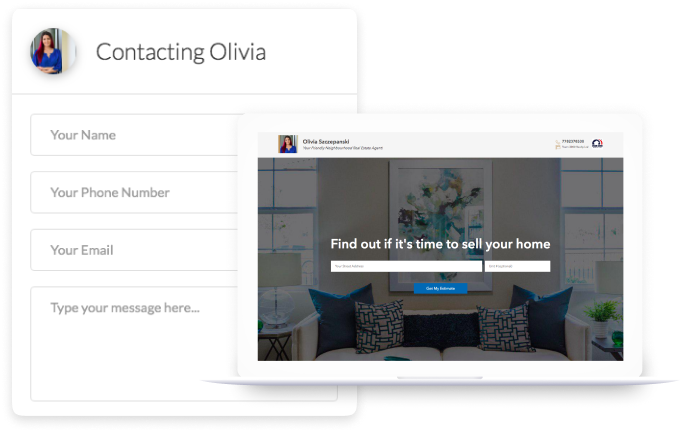
Real Estate is a visual business. Almost in every aspect of Real Estate images and videos are used to provide the audience with an insight into the matter. Whether they are trying to buy a home or sell one, your landing page should use stunning and eye-catching Images that are aligned with the offer. You should not use a boring page with text and minimal images.
Make it Fast and Responsive
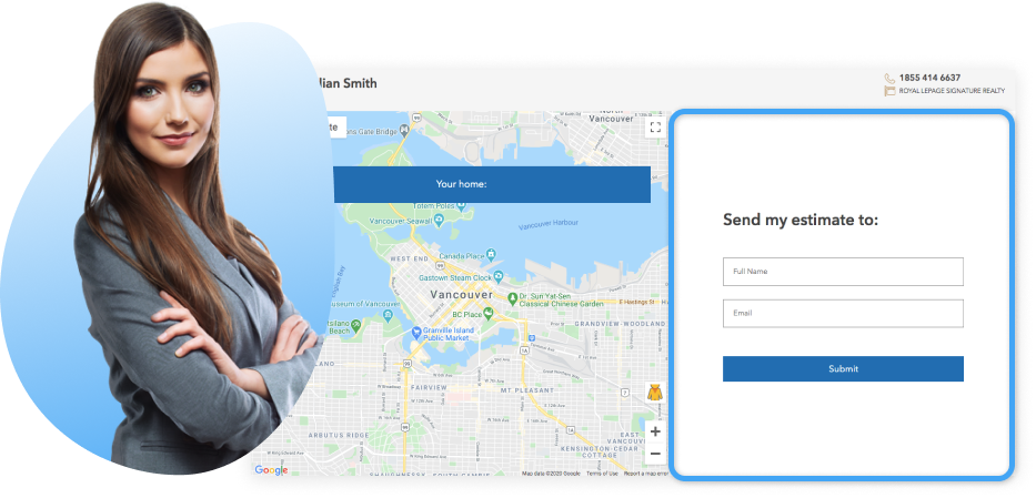
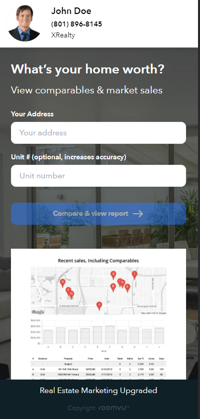
On the other hand, please consider the fact that your page will convert better if it loads fast. Using large videos and images that take longer to load will discourage some of your users from running on slow connections. Make sure that your landing page runs and loads fast and shows well on mobile devices. Many people these days use mobile devices to browse the web and that includes looking for homes.
Do Not Bore The User
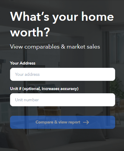
Most landing pages include a few fields of information users have to fill in order to claim the offer. This information is your leads and you can use them to nurture them further and make them into qualified leads. They often include fields like name, email, phone number, etc. While including a lot of fields on the landing page to get maximal information might sound like a great idea, remember that most users will not bear such a long array of fields. Most will leave and you will lose them. Just stick to the bare essentials and you are good to go.
Present a Clear CTA
Landing pages should be very clear to navigate. Users must be able to find out what to do next and claim the offer as soon as possible. Therefore, Your CTA (Call-To-Action button) should be very clear. Try different CTAs and see which one works better. It should express your offer easily without confusing the users.
On the other hand, A landing page has only one journey. Avoid putting extra links on the landing page that might distract the users. There is really no use to put the links of your social media or your website on the landing page as they might stop the user from clicking on your CTa. That will simply negate the purpose of the landing page.
Use Landing Page Templates
If you are not sure how to create a landing page and design it with images, copy and CTA, you can always use landing page templates that are designed specifically for Real Estate. All you need to do is to change some information including your branding and contact information and you are set to go. You do not need to worry about improving the landing page as they have already been optimized to maximum performance.



One Comment