Tips for Creating a Better Landing Page for Real Estate
Everything on a landing page for Real Estate has to be simple, eye-catching, concise and to the point to make sure that it keeps users on the page and guides them towards your CTA

Designing converting landing pages for Real Estate is essential for every agent. The average conversion rate across all industries in Google AdWords is 3.75%, However, in Real estate the average is only 2.47%. In fact, landing pages are secret weapons agents can use to level up their marketing game along with their efforts on social media, their website, etc. So, we decided to gather all the best tips for creating a better landing page for Real Estate.
Tips for Creating a Better Landing Page for Real Estate
Without further ado, let’s see how you can optimize your landing pages for Real Estate:
Keep it Simple
Landing pages work because they are focused on a sibnlge message. they are designed to guide the user in a certain, specific and clear path that ultimately leads to an action. Therefore, making your landing page complicated and complex negates the purpose and the idea behind landing pages.
It is better to keep everything simple on your landing pages. From the images, to the messaging, copy and the CTA, everything will yield better result if they are kept as simple as possible.
Simple landing pages will help the user find their way on the landing page easier and will avoid confusion and ambiguity. Landing pages are very sensitive in this case and failure to keep things simple will result in user confusing and ultimately them leaving the page.
Keep it Eye-Catching
We said your landing pages should be simple to avoid confusion but that does not mean they should be boring and ugly. In fact, you should try your best to make them exciting by using beautiful, images, videos and design.
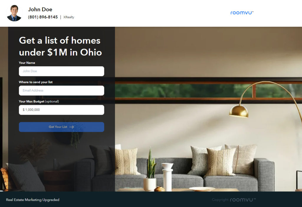
On the other hand, other elements of your landing page, including your logo, testimonials, social proof, etc, should all be aligned visually with the general theme of the landing page. Make sure you use your branding like your brand colors and logo coherently with the rest of the design.
Have a Clear Copy
You do not want to deter users by using unrealistic copy and promises that are too good to be true. Keep it honest and clearly state your value proposition. You will not try to deceive any one by using exaggerated language that will fail to gain trust. On the contrary, this kind of language will not only fail to gain trust but on the ther hand will deter users as your landing page seems to be unrealsitic.
Include a Direct Heading
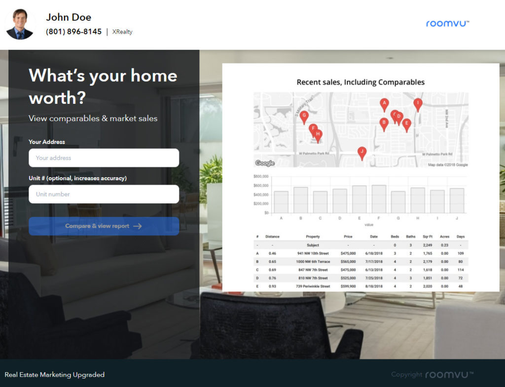
Heading on a landing page is mainly a short message that shows up as the most important text on the page. For example “What’s your home worht”. Keep it conmsice and to the point. This message also needs to be aligned with your ad so the user knows immediately that they are going to get what they came for. Avoid confusing the users by exaggerating headlines aimed at seducing the user.
Have a Clear CTA
Once the users visit your landing page they should be able to easily get what they came for. Everything they need to see and do including the forms and the call to action button should all be clear and easy to get. Make sure your CTA button uses proper copy and design. You can ask for professional help in this case if you are not sure.
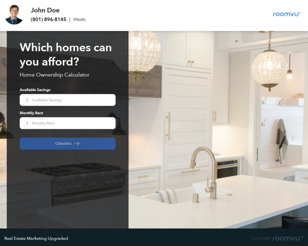
On the other hand it is important to make the CTA appear above the fold so that users can see it without having to scroll down. Trust me, but many users will not bother the explore the page and see where they have to take the next step.
Make it Mobile-Friendly
The majority of users access the internet from a mobile device. e now use computers, tablets, and smartphones to scour the web, scroll through social media, and access the information we need. In fact, close to 80% of Americans own a mobile device and the majority of search traffic on the internet comes from them!
Therefore, your landing page must be responsive. That means it is mobile-firendly and will show properly on a mobile device. .Failure to do so will result in your landing page showing very small on a mobile device where the users had to zoom in and scroll;l; around to see the content of the page. And that is definitely a big no for users. Noone will bother to do so.
No Extra Links
If you think your landing pages do not convert well it is not a bad idea to see if it is cealr enough or naot. Maybe you have to many navigational link on it which confuse the users. If there are extra links on your landing page, chances are users click on those before getting to your CTA.
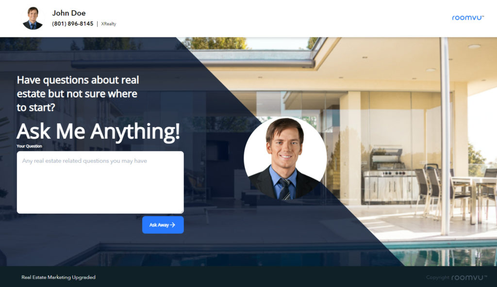
Make sure you get rid of all the unnecessary links on the landing page that do not serve the purpose of the page. Save them for your website regardless of how important they are. You main menu does not have to be on the landing page.
Make Your Forms Short
Including sign-up forms on your landing pages is a great way to capture valuable leads for your Real Estate business. However, you should not use fields sparingly. Forcing the user to fill up long forms is a sure way to lose them. Users do not want to spend a long time filling up forms. In fact, nopne of us do. And they may not feel comfortable providing you with all that information regardless fo your offer.
suffice to the bare esseantrials and forget about all other info you have on your mind. You probably do not need all of them. Make it short and sweet where users can easily fill up the form in a few seconds to get your offer.
Make it Fast
A 2018 research by Google revealed that 53% of mobile users leave a website that takes longer than three seconds to load. That shows how impatient users are when bropwing the web. Regardless fo the graphics and elements of your landing page you have to make sure it loads fast. There are many tools you can test the speed of your landing page. If it takes long to load, make sure you fix it ASAP. Putting autoplay videos on the landing page that take ages to load is not good idea for sure.
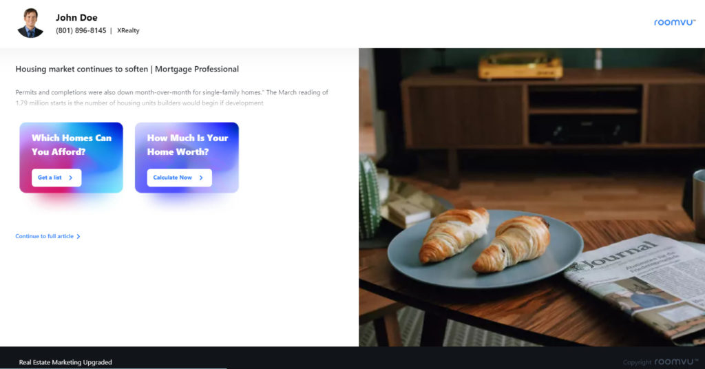
Tips for Creating a Better Landing Page for Real Estate: Takeaways
Everything on a landing page for Real Estate has to be simple, eye-catching, concise and to the point to make sure that it keeps users on the page and guides them towards your CTA. These tips for creating a better landing page for Real Estate, are essential to create the landing page, fast, mobile-friendly, clear and beautiful. You pay a lot for you ads, you might as well make sure your landing pages live up to the promises you made on the ads.


